


A Trip Down Memory Lane
On July 6, 2014 – we relaunched our website in commemoration of our 10th anniversary. This is a simple record of our website’s journey…. from the beginning.
 In 2004, the original website was launched – but had no online shopping capability. Public awareness of the internet only really started in the late 1990’s. Even in 2005, online shopping was still a new concept for a lot of retailers.
To put all our products online, we spent hundreds of hours to photograph, crop, and document the products.
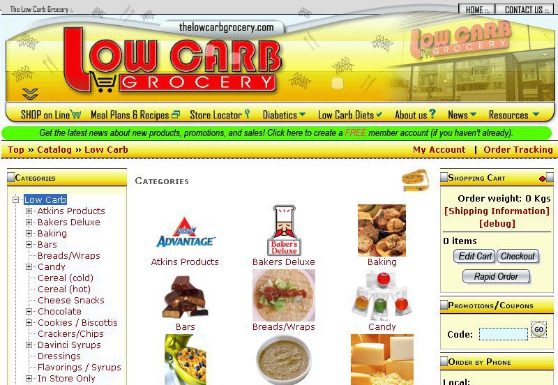
Back then, many people still used CRT screens and we optimized the website for 800x640px (can you believe that? How did we live?)
The Low Carb Grocery website (2005 to 2010)
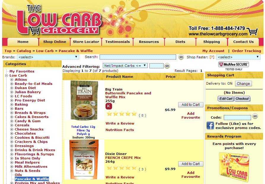 In 2010, computer screens were getting bigger. More people were using computers with at least 1024x768px resolution — so we reworked our site on a very tight budget — to have a standard width of 1000px wide.
Still ugly by 2014 standards, but this was still a leap forward in terms of looks, would you agree?
We also added a points program and a tonne of new custom features to make the site more useful for our regular customers.
Also very tricky probem to solve was the addition of our Vancouver/Burnaby store …. dealing with situations where some products are available from one location (serving BC, AB, SK, and YT), but not the other (and vice-versa).
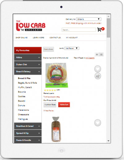
The Low Carb Grocery Website (2010-2014)
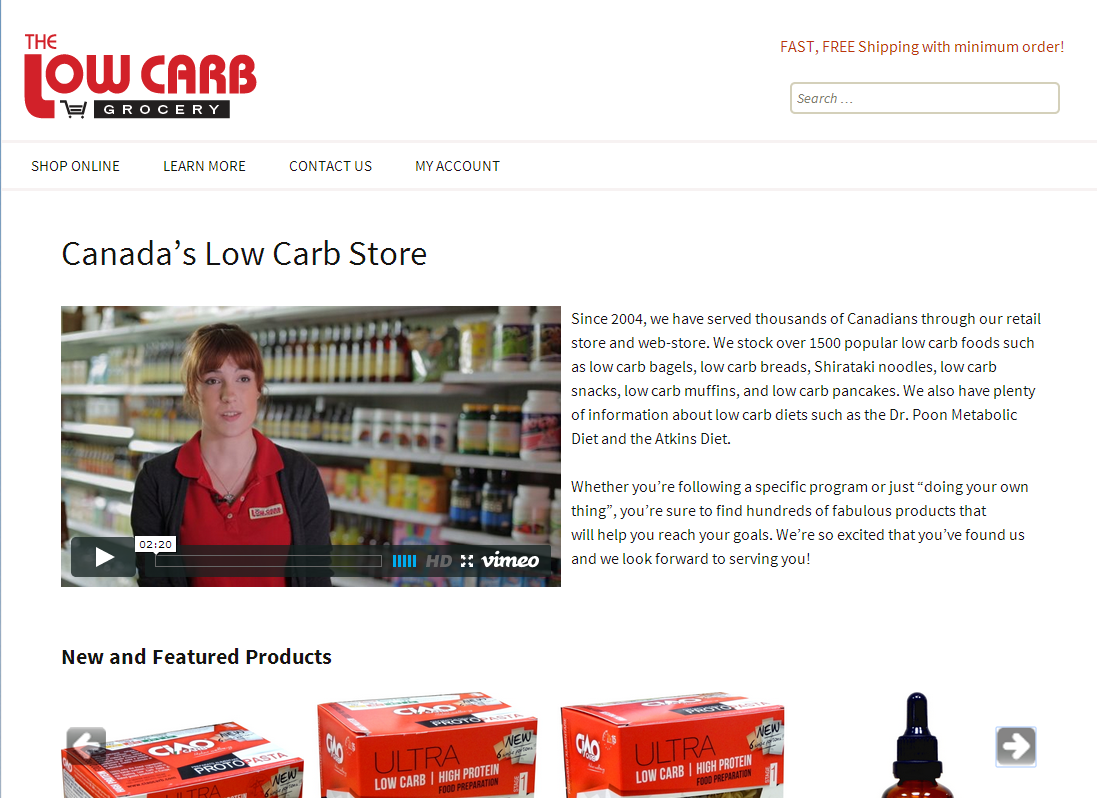
That brings us to today! This time, we put a lot more creative energy into designing what we believe will be one of the best food shopping websites …. in the world!
Our logo was also refreshed with cleaner lines and bolder colours. But its not just looks — we really focused on usability.
For example, the previous website had 35 primary categories and each category had subcategories for each brand. If each category had on average 5 brands,… thats 175 categories!(finger cramps from clicking?) Also, new customers often are not familiar with our products – so we added the capability to sort by popularity and sort by carb count (the latter is a pretty darn cool feature, ain’t it?)
For people who like to find brands quickly (which is why we had all those the brand subcategories in the first place), we added a Filter by Brand function in each category… so there was no loss of functionality. (Some neat thing still to come on this front who liked the older style of brand categories…. stay tuned)
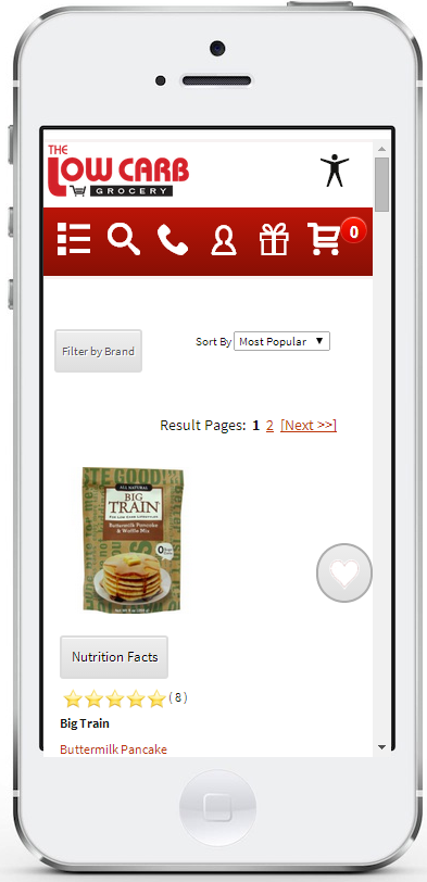
And of course, screen resolutions improved again with many users having 1920x1080px (HD) or better resolution … but they also got a whole lot smaller. So we also invested a lot into making our website responsive to the device type. We also think we have one of the best mobile shopping experiences for food retailers.
 Boy, this was a lot of work… but we’re so pleased with the result and we hope you like it too.
Making all our stuff fit was like trying to use a twin sized bed sheet to cover a king sized mattress. We had to really think about strategies for tucking things away, swinging menus out of sight, etc…
If you have any suggestions to make our website better – please contact us. We REALLY want to hear from you. Our goal is to provide you with a world class online shopping experience that is not only functional – but a joy to use.
….thanks for reading this far!